People’s Association (PA) Dashboards – From Raw Data to Strategic Insights

People’s Association (PA) Dashboards – From Raw Data to Strategic Insights

The People's Association's MESRA Council coordinates community programs across 11 M³@Towns and 5 Focus Areas (FA), serving as a vital bridge between grassroots initiatives and national social objectives. However, program effectiveness was hampered by three critical data challenges: information trapped in siloed formats (PDFs, Excel, emails), inconsistent performance metrics across towns, and labor-intensive manual reporting processes that delayed insights. To unlock the full potential of this community data, we implemented a dual transformation: establishing standardized data governance while developing intuitive quarterly dashboards that combine quantitative metrics with qualitative success stories. This case study demonstrates how strategic UX design and data structuring converted fragmented records into a transparent, actionable system.

The People's Association's MESRA Council coordinates community programs across 11 M³@Towns and 5 Focus Areas (FA), serving as a vital bridge between grassroots initiatives and national social objectives. However, program effectiveness was hampered by three critical data challenges: information trapped in siloed formats (PDFs, Excel, emails), inconsistent performance metrics across towns, and labor-intensive manual reporting processes that delayed insights. To unlock the full potential of this community data, we implemented a dual transformation: establishing standardized data governance while developing intuitive quarterly dashboards that combine quantitative metrics with qualitative success stories. This case study demonstrates how strategic UX design and data structuring converted fragmented records into a transparent, actionable system.

DURATION

1 year

MY ROLE

Lead Designer

CLIENT

People’s Association (PA) Malay Activity Executive Committee Council (MESRA)

TAGS

Data Visualization, Dashboard Design, DataGovernance, Data SenseMaking, Government Tech, StakeholderEngagement

My Role

My Role

Led end-to-end design and implementation:

  1. Data Architecture & Standardisation

    • Designed and implemented structured Excel templates with validation rules to ensure data consistency across 11 towns

    • Developed automated processes to transform disparate PDF/Excel reports into an analysable dataset

  2. Stakeholder Engagement & Change Management

    • Facilitated cross-town workshops to establish unified KPIs and reporting standards

    • Created transition materials and training to shift teams from static PDFs to interactive dashboards

  3. Information Design & Storytelling

    • Translated complex community metrics into clear visual narratives

    • Balanced quantitative data with qualitative success stories to showcase program impact

  4. Dashboard UX Design

    • Developed intuitive visualisation systems including: Progress tracking (actual vs. target comparisons) and At-a-glance performance indicators

    • Implemented iterative design process incorporating user feedback from town coordinators and leadership

Key Pain Points

Key Pain Points

  1. Data Fragmentation

    • Inconsistent formats (e.g. PDF reports, Excel files, email threads) led to version control problems

    • No centralised system for tracking progress or comparing performance across towns

  2. Inconsistent Performance Measurement

    • Towns used different definitions for core metrics (e.g., measuring "engagement" as either attendance or survey responses)

    • Leadership lacked standardised benchmarks to assess program effectiveness

  3. Reporting Burden Obscured Insights

    • Staff spent 20+ hours monthly manually compiling reports instead of analyzing data

    • Decision-makers received outdated information in static PDFs, delaying responsive actions

  4. Data Hygiene Gaps

    • Despite alignment workshops and guidelines, towns reverted to old formats, creating cleanup bottlenecks.

Defining the Problem Statement

Defining the Problem Statement

How might we transform MESRA’s disparate, complex datasets into an intuitive, interactive dashboard that enables leadership to quickly grasp performance, compare initiatives, and make data-driven decisions?

Project Goals & Objectives

Project Goals & Objectives

  1. Standardise & Centralise Community Data

    • Create unified metrics and collection methods across all 11 M³@towns and 5 Focus Areas

    • Develop a single source of truth for program performance tracking

  2. Transform Reporting from Burden to Insight

    • Reduce manual data processing time by 75%

  3. Drive Data-Informed Decision Making

    • Surface actionable insights through intuitive visualisations

    • Highlight both quantitative results and qualitative impact stories

Solutions

1. Master Data Framework Implementation

  • Developed Unified Templates: Created standardized Excel templates with locked cells, dropdown menus, and automated validation rules to enforce consistent data entry across all 11 towns.

  • Established Data Mapping Protocols: Documented precise field-level relationships between town submissions, master datasets, and dashboard visualizations in the Master Data Guide.

  • Outcome: Reduced data cleaning efforts by 75% and eliminated version control issues.

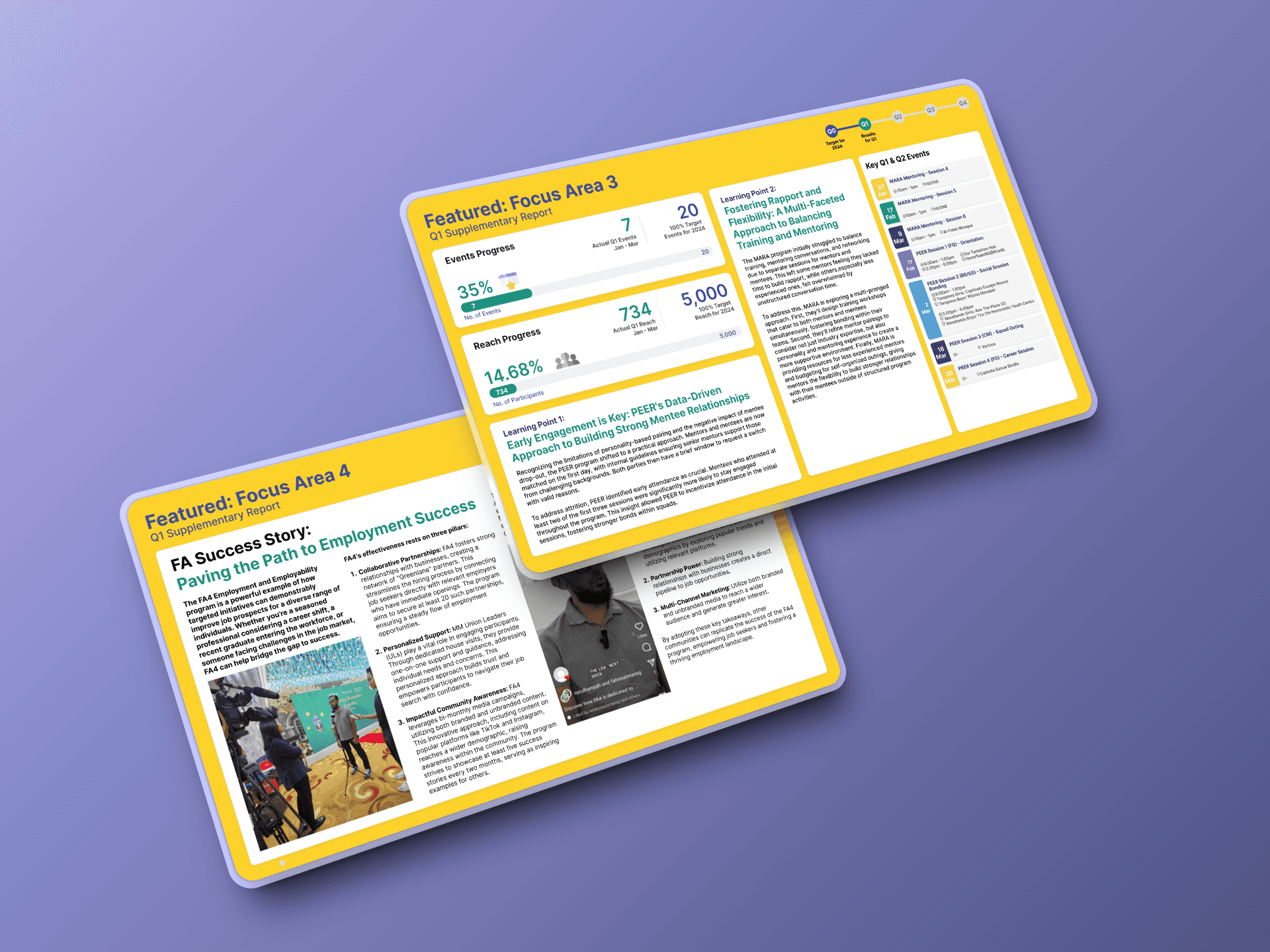
Quarterly Deliverables:

Focus Areas (FAs)

M³@Towns

Special Programs

1x Overview Dashboard (All 5 FAs)

1x Overview Dashboard (All 11 Towns)

1x Project Dian Overview Dashboard

2x Featured FA Reports

2x Featured Town Reports

1x Featured Project Dian Learning Report

3x FA Supplementary Reports

9x Town Supplementary Reports


2. Visual Governance System

  • Designed Interactive Data Flow Diagrams: Built visual schematics showing how raw inputs transform into dashboard metrics, colour-coded by focus area.

  • Implemented Validation Alerts: Integrated system flags for outliers (e.g., attendance >100%) with correction guidelines.

  • Outcome: Decreased data discrepancies by 90% in Q2 rollout.

3. Change Management Program

  • Conducted Role-Specific Training: Held separate sessions for town coordinators (data entry) and leadership (insight extraction).

  • Outcome: Achieved 100% template adoption within 8 weeks.

Results & Impact

1. Operational Efficiency Gains

  • 90% Reduction in data processing time (from 20+ manual hours to <2 automated hours per quarter)

  • 100% Adoption by leadership within 2 quarters, replacing legacy PDF reports

  • 40% Fewer Reconciliation Queries from towns due to clear Master Data Guide instructions

2. Decision-Making Improvements

  • Faster Strategic Adjustments: Leadership identified program gaps 3x faster using filtered dashboard views

  • Improved Resource Allocation: Comparative town/FA analysis revealed 5 underperforming areas needing intervention

  • Enhanced Transparency: All metrics became traceable to source data, increasing stakeholder trust

3. Quality & Compliance

  • Data Accuracy Improved from 58% to 89% audit score within 6 months

  • Standardisation Achieved: 11 towns now use identical reporting formats (vs. 7 different versions previously)

Results & Impact

Key Learnings

1. Operational Efficiency Gains

  • 90% Reduction in data processing time (from 20+ manual hours to <2 automated hours per quarter)

  • 100% Adoption by leadership within 2 quarters, replacing legacy PDF reports

  • 40% Fewer Reconciliation Queries from towns due to clear Master Data Guide instructions

2. Decision-Making Improvements

  • Faster Strategic Adjustments: Leadership identified program gaps 3x faster using filtered dashboard views

  • Improved Resource Allocation: Comparative town/FA analysis revealed 5 underperforming areas needing intervention

  • Enhanced Transparency: All metrics became traceable to source data, increasing stakeholder trust

3. Quality & Compliance

  • Data Accuracy Improved from 58% to 89% audit score within 6 months

  • Standardisation Achieved: 11 towns now use identical reporting formats (vs. 7 different versions previously)

1. Governance Requires Continuous Reinforcement: Even with perfect templates, quarterly refresher sessions were essential to maintain standards

2. Design Must Serve Dual Audiences: Town coordinators needed structured inputs (templates with validation) & Leadership required flexible outputs (customisable dashboard filters)

3. Success Stories Drive Adoption: Featured reports showcasing town achievements created healthy competition and buy-in

4. Scalability Demands Documentation: The Master Data Guide became critical when onboarding 3 new PA divisions

Key Learnings

1. Governance Requires Continuous Reinforcement: Even with perfect templates, quarterly refresher sessions were essential to maintain standards

2. Design Must Serve Dual Audiences: Town coordinators needed structured inputs (templates with validation) & Leadership required flexible outputs (customisable dashboard filters)

3. Success Stories Drive Adoption: Featured reports showcasing town achievements created healthy competition and buy-in

4. Scalability Demands Documentation: The Master Data Guide became critical when onboarding 3 new PA divisions

Let's Collaborate

Let's talk about a project,
collaboration or an idea you may have

Let's Collaborate

Let's talk about a project,
collaboration or an idea you may have

Let's Collaborate

Let's talk about a project,
collaboration or an idea you may have

Let's Collaborate

Let's talk about a project,
collaboration or an idea you may have